
Project Lead, UX designer
Daniel Marson, Lewis Boodt, Kieran Weilers, Yaw Danko
The AA and Big Radical, formerly known as Monitise Create, had established a partnership with the AA GB motor company in 2016 that gave Big Radical a retainer model. However, for many months there was no project. So we decided to roll our sleeves and take a look at their mobile app, which lacked consistency and was challenging to use. Our goal was to establish Big Radical as a trusted partner, beyond paper, and improving their app mobile experience. The proposed solutions needed to be applicable for iOS and Android.
I was responsible for organizing the kick off the workshop with the client, scheduling the project, preparing the testing sessions, presenting the work to the client and making decisions about the direction of the solution.
Before the project started, we did an audit of the interface pointing at UX and UI flaws of the interface. The main purpose of the app is to help its users to do route planning. The app also includes member benefits and reporting a breakdown.
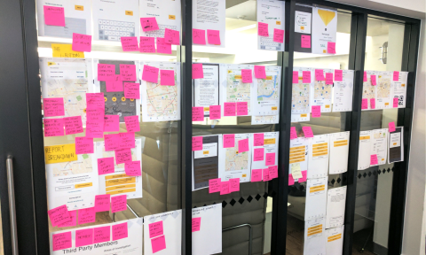
All the found issues were captured in a spreadsheet and prioritized into areas of the app that had higher impact to the user experience and would be easier to tackle.
These are the 4 areas we selected as quick wins for the user experience:
The registration flow was long and lacked useful information for the app users to proceed with the registration, such as, where to find the 16 digit member number. In addition, the order of the content in the flow was confusing.
Third party members, people that have a cover with The AA through a third party but are not members that downloaded the app, consider themselves AA members, but they are not. They would think they have all the information necessary, and then, try to register. In consequence, they received no adequate feedback when they introduced the wrong information. Their type/tier cover was not considered in the app.
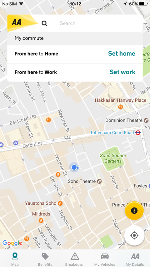
The map had on a floating i-button. We assumed the users confused the i-button with information about the map and as a result considered the button useless. Hidden inside the i-button there were 4 different features related to the map. Basically filter types such as traffic, parking, etc.
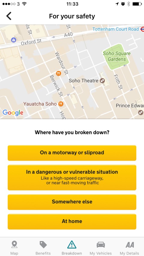
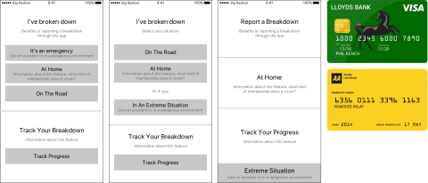
Report a Breakdown was a long process and resort to calling to report the breakdown instead. The "broken down location" screen was confusing and frustrating due to the choices and labelling. The order and presence of button elements were also confusing. Users were not aware of the benefits of reporting digitally.
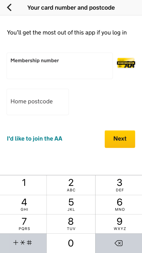
- Validation needs to be secure - It should follow an understandable order - It shows where the user is in relation to the registration process - It should display the benefit/s of registering - Facilitates the completion of the registry
- It should separate members from 3rd party cover affiliates - It should provide a feedback mechanism for 3rd party cover affiliates to know what is their next step
- The map should have a clear function - The features inside the i-button should clearly inform of their function - The function of the i-button should be clear (if applicable) - The filtering options inside the features should be consistent - The number of interactions should be short - Make the pins on the map visible all the time
- The process of reporting should communicate progression - Unnecessary elements should be removed or modified (like the map) - The benefits of reporting in the app should be displayed - The steps of the flow should be clearly signposted - It should have a clear visual hierarchy General. - Maintain the visual design.
Initial draft of the requirements from the workshop
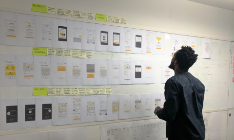
To make sure that The AA was getting a ready to implement outcome, we set a space in the office with all information that we had available. We also created an area for any question that popped into our minds. We brainstormed 1 hour for each of the sections in the app and defined the criteria based on the feasibility of the idea and quality of the user experience.
We created initial wireframes to make the concepts more tangible and ready to review with the client. After the review, we amended the wireframes and wrote the script for the testing session with users. The testing sessions aimed to give us answers on the usability of the concepts. Did the test subjects understand the signposting? Did they find what we asked them to find? If not, why?
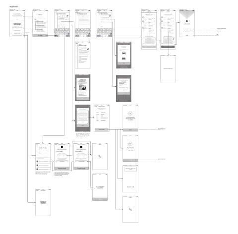
Registration flow
A/B testing the and prob materials
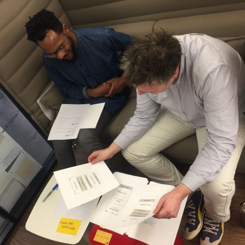
Testing the wireframes with expert user
Gathering feedback after the Testing
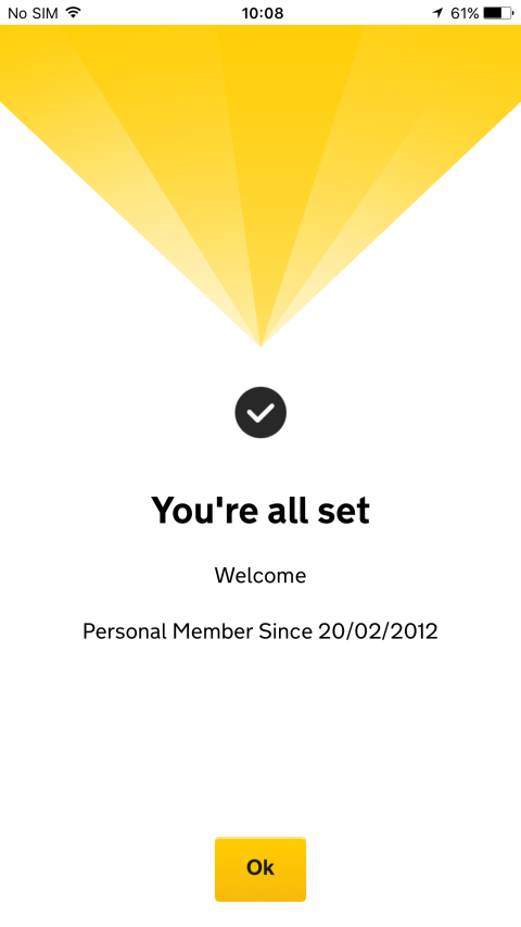
We increased the signposting of the registration flow to increase the number of users registering in the app without confusion and mitigate the poor experience of third party breakdown users.
We increased the proportion of members successfully reporting a breakdown entirely through the application by streamlining the number of options available.
We improved the interface by exposing the functionality that was buried under the "i-button".
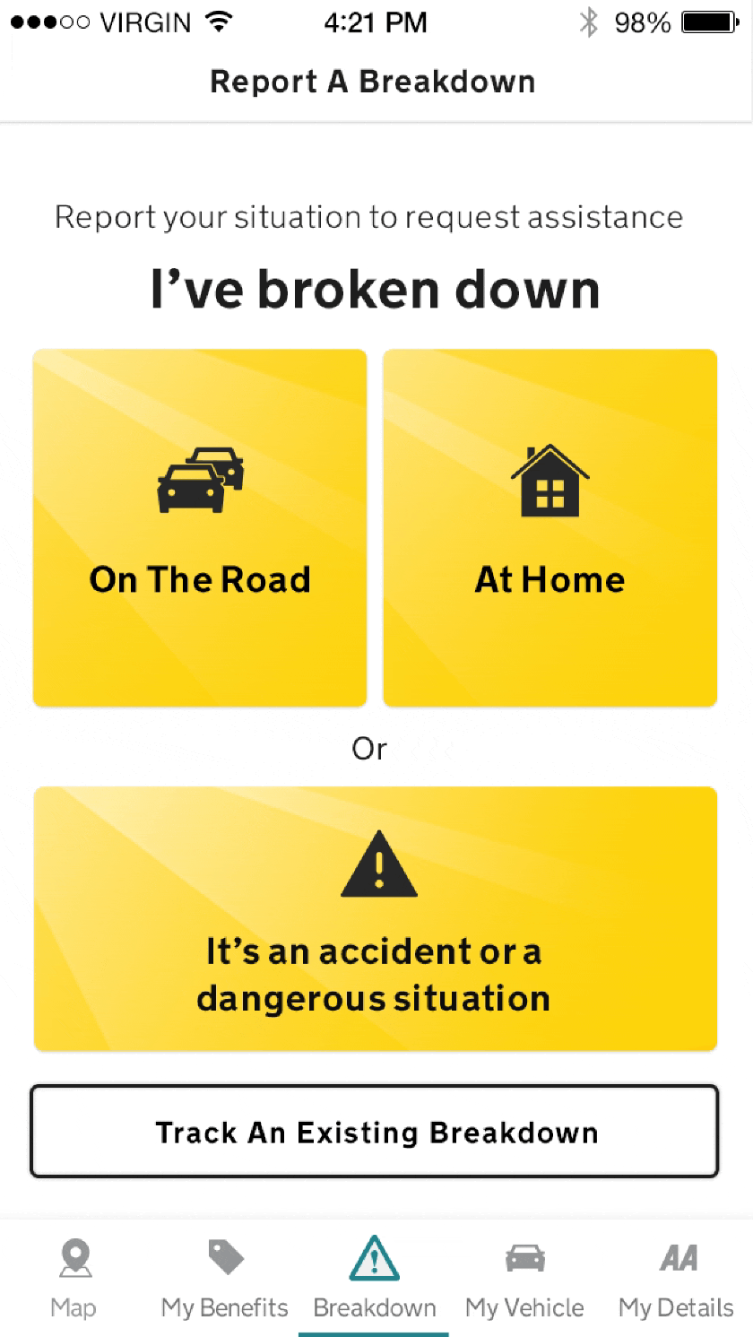
Report Breakdown
≈ 10%
≈ 15%